
flower lodge
fresh, high quality flowers from your friendly florist

the briefFlower Lodge is a local, friendly florist known for its fresh and high-quality flower arrangements. The brand would like to incorporate the shop's beloved dog, who has become a recognisable figure, into its identity to attract attention and establish a strong association between the name "Flower Lodge" and the florist in people's minds.
I would like to refresh my current logo as it’s starting to look a bit dated and no longer reflects who we are. I would like the Flower Lodge's brand identity to embody a country, natural, rustic yet modern aesthetic. The brand should evoke feelings of brightness, freshness, youthfulness, warmth, and friendliness. It should resonate with customers seeking a welcoming and down-to-earth experience when visiting the shop.
requirementsBranding
Illustration

I wanted the logo design for Flower Lodge to prominently feature the shop's dog, serving as a visual focal point. Illustrating the dog in a playful and charming manner, helps to symbolise the shop's unique character and creates a memorable association. The overall logo conveys a sense of nature, rusticity, and modernity through its design elements, colours, and typography.
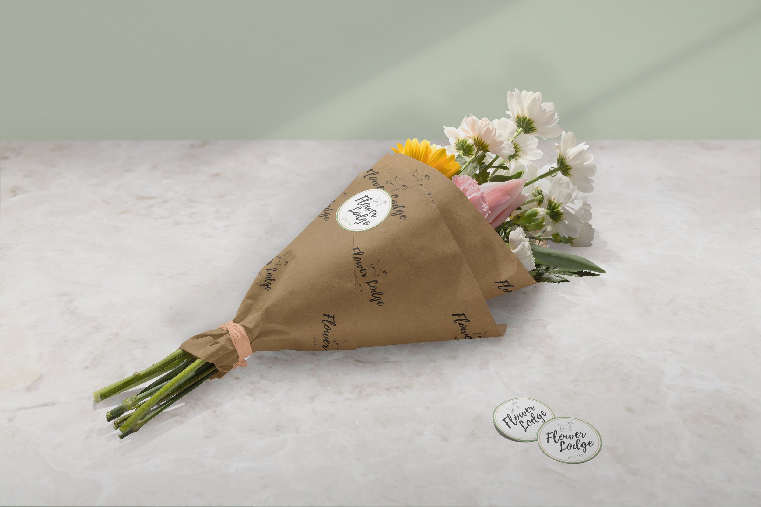
The packaging for Flower Lodge also needed a re-fresh to align with the brand's new identity. Showcasing a harmonious blend of country and modern elements, incorporating natural textures and earthy tones. Consideration was given to practicality and sustainability, utilising eco-friendly materials whenever possible. By using brown paper bags and craft paper to wrap the arrangements, it furthers a warm and friendly feel.


I sketched out a couple of differed style Border Terrier dogs as it was a key element within the brief. When happy I took them into Illustrator to vectorise the two which I thought would work best within the logo concepts.
I didn’t want the dog to over power the logo as I didn’t want the outcome to look confusing and more like a grooming parlour. Using thin lines for the dog illustration and bold type and flower illustration kept a nice balance.


